Suburban Development | Bonn
2. Prize I Suburban Development
Bonn
In collaboration with Baufrösche Architekten und Stadtplaner GmbH
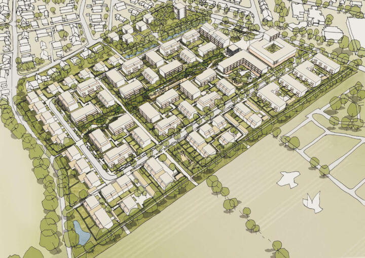
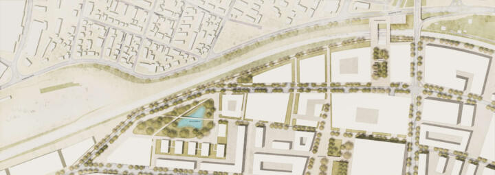
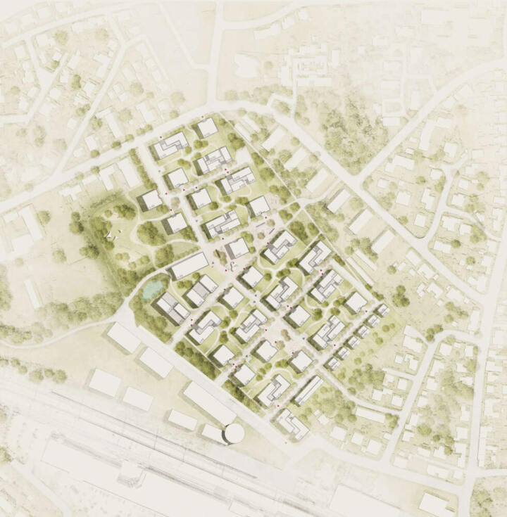
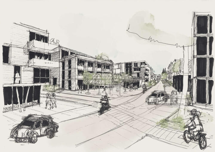
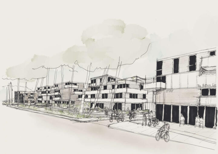
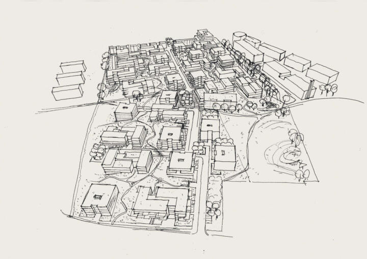
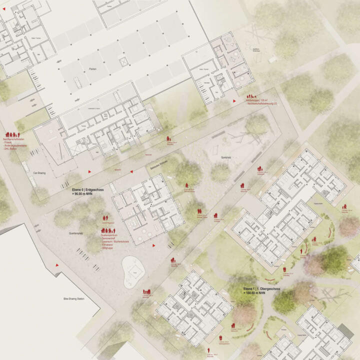
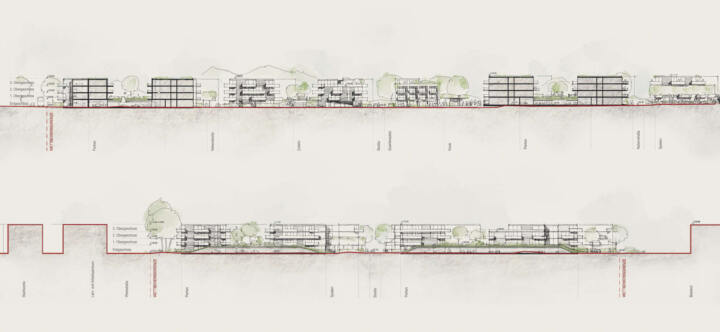
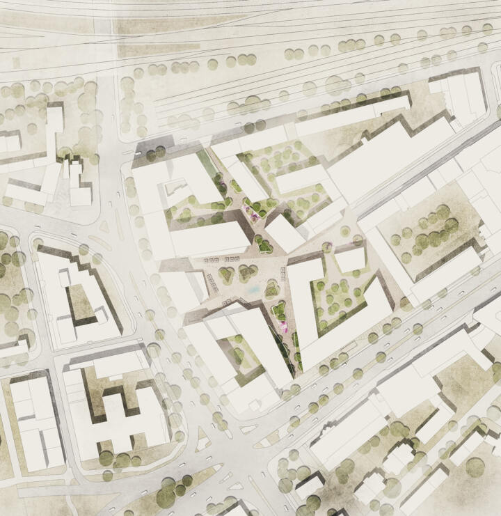
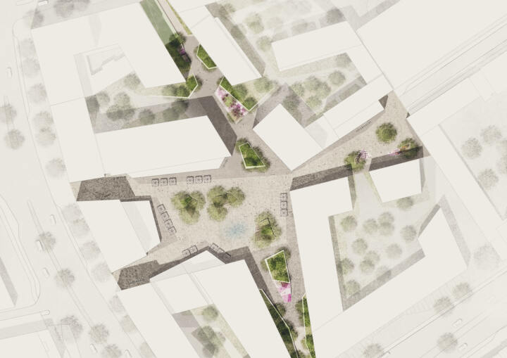
In the development of the urban design, the “good” neighbourhood in the area is in the foreground. All building plots are clearly delimited and can use the special features of the allocated land for their “own neighbourhood” and identity. The preservation of formative wooded structures in connection with new green structures, a market place with gastronomy and a supermarket increase the qualities of stay and ecology for residents and visitors.
Urban planning concept
The new residential quarter with the market place, bus station, supermarket with senior citizens’ center, day care center and a restaurant loft forms a new center in the Roleber district. This identity-creating concept is a sensible addition to the existing structure, enriches the public space and is sure to become a popular meeting place in the district. Our design carefully develops the existing urban situation at the edges and uses the building sites at the central park and market place for moderate densification with apartment buildings. The urban development concept allows for flats of exceptionally high quality due to the generous relationship to the outdoor space, the creation of a clearly defined private sphere and the high-quality development.
- detached house cubes
- good ventilation and comfortable microclimate
- optimal building orientation
- good lighting for all flats
- residential courtyards with a communal center
- terraced house complexes with a neighbourhood square
- attractive row of semi-detached houses with a view of the nature reserve
- clear completion and rounding off of the development vis-à-vis the FFH and nature conservation area
- garden courtyard houses at the transition to the existing detached houses
- stacked single-family houses (Einspänner) and a residential tower in the Alleen quarter
- compact residential courtyards without basement close to the neighbourhood garage
- development ring with visitor parking for short distances
- a day-care center with a connection to the park and market place
- Diversity in the house typologies and thus also diversity in the housing offer
- No direct orientation of private open spaces / balconies towards the cemetery
- Fire protection – predominantly three-storey construction, where possible with staggered storeys and a residential tower with safety staircase
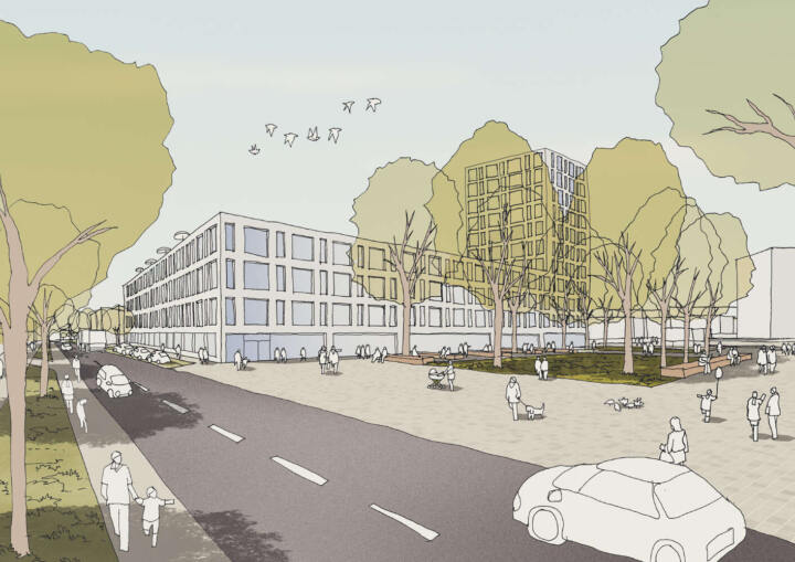
- a supermarket and a restaurant loft at the bus station and market square
- a senior citizens’ center above the supermarket for residential groups and assisted living
Concept for open spaces
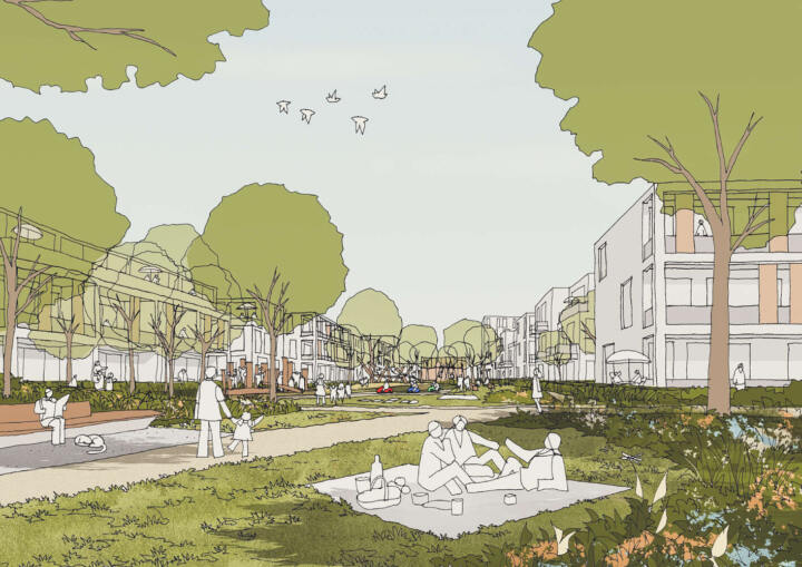
The urban development concept results in a high proportion of green spaces with characteristic woody structures, sophisticated planting and attractive garden areas. The central park as a “playground” for young and old and a market place offers spaces with high quality of stay.
- Large, varied green and drainage areas
- Preservation of characteristic woody structures
- Multi-layered uses on the neighbourhood square, e.g. as a boules court, market place, open space for playgrounds and youth mobiles, meeting place and a location for neighbourhood festivals.
- an “equipment playground” with a connection to a green corridor in the optional development areas.
- Fitness park with exercise equipment in the central park
- preservation of the “moat” with its magnificent tree population
- all roofs will be extensively greened
- Rainwater is collected in cisterns and used for garden irrigation
- All excess roof water and rainwater on the development paths will be infiltrated into the adjacent green spaces in partially widening seepage trenches to improve the balance of groundwater recharge in the area.
- Retention trough for rainwater as a small biotope
- Parking spaces with infiltration joints
- safe pedestrian connections
- the preservation of large existing trees and the generous green spaces with new trees meet the increased need for urban green space as a buffer for heat and heavy rainfall events due to climate change and as a dust filter
RT unlimited and BETZ-Areal | Reutlingen
1. Prize | RT unlimited and BETZ-Areal
Reutlingen
In collaboration with HHS Planer + Architekten AG and LK Argus GmbH
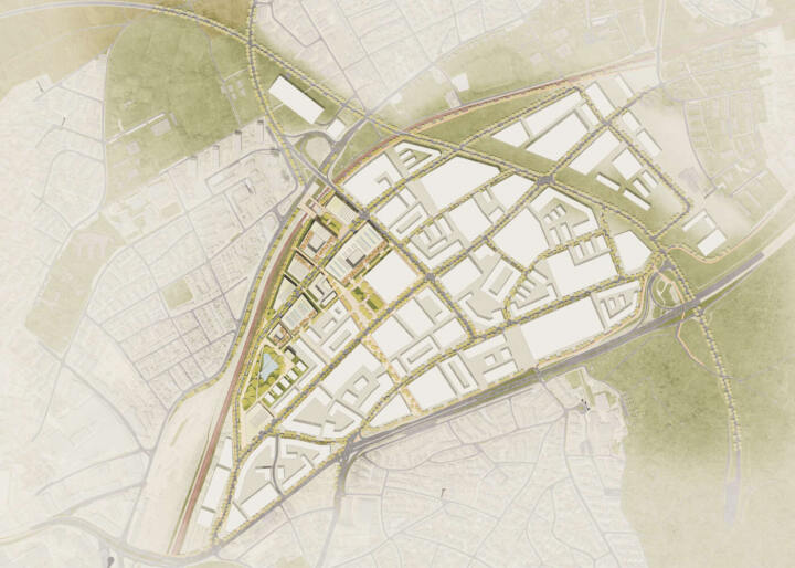
Climate change and social change are the outstanding issues of future-oriented development. The climate turnaround can only be achieved if a turnaround in transport design is also successful. The central task will be to reconcile this with the necessary mobility needs, also in Reutlingen unlimited. The basic consideration for the traffic planning concept is thus to deal sensitively and sustainably with the existing traffic infrastructures in the planning area. The reorganisation and adaptation of the traffic development will take place on the basis of the existing situation. The current main access road, Max-Planck-Strasse, can be almost completely retained.
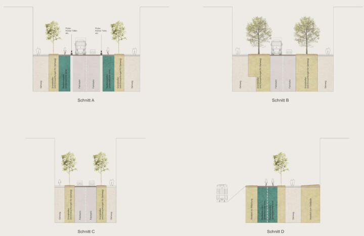
Against the backdrop of climate change and a changing awareness of “healthy mobility”, structures are to be created within the area that structures are to be created within the area that support appropriate forms of locomotion. Therefore traffic areas within the area should be differentiated and areas are to be created that enable safe movement by bicycle and on foot. The creation of safe cycle paths will make it possible to cross quickly and safely.
With the establishment of bicycle rental stations and protected parking facilities and bicycle boxes within the area. Cycle traffic is additionally promoted. The cycle paths and footpaths connect the open spaces within and outside the site and connect to existing pedestrian and and cycle paths. In addition to the footpath and cycle path connections, the area is served by public transport with buses and, in the future, additionally by smaller electric and hydrogen mini-buses.
Urban planning concept
- High density, urban city spaces,
- attractive neighbourhood open spaces,
- low traffic load,
- flexible parcelling,
- flexible arrangement and modification of walls and storey ceilings,
- sustainable buildings.
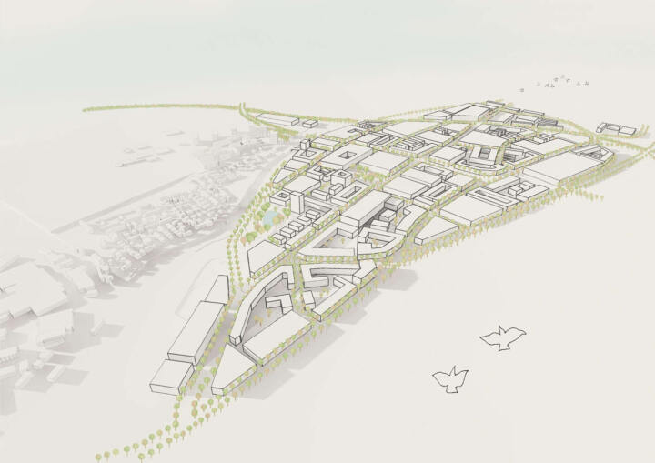
Generous neighbourhood squares are created at central points in the planning area. At public uses will be located at the edges of the squares (local supply, fitness, childcare). The squares are within easy walking or cycling distance. The RTUnlimited industrial area is being developed around the neighbourhood squares.
Open space concept
The understanding of public space as an animated urban area is a central building block of the overall concept. The aim of this concept is therefore to significantly upgrade streets, squares and paths, primarily as recreational areas and only secondarily as traffic areas.
This is a decisive prerequisite for the development of an attractive and liveable district. For these reasons, the main development is generously dimensioned as the central backbone of the neighborhood. The boulevard, furnished with high-quality trees and furniture will be upgraded with an independent profile. The squares are the identity-forming point of the area.
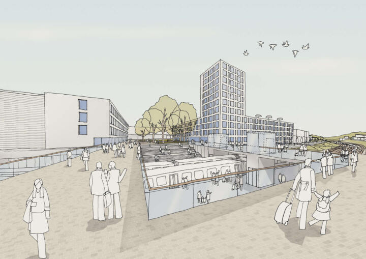
In the realization part, the area develops from the “entrance square” towards the west. The bus stops, the suburban railway and a multi-storey car park are connected via this square. In addition, the square takes on the function of a public neighbourhood square that opens up to the boulevard. This creates an attractive urban space with a high quality of stay, traffic safety and social control for pedestrians and cyclists, and promotes a representative address for the neighbouring businesses and customers.
Overall, the development system can be characterised as finely structured, clear and open. The different zoning, street space divisions, the clear visual axes and the square-like expansions along the main development along the main development – the “Green Boulevard” – results in optimal orientation for all road users. This urban promenade not only opens up the entire commercial area, but also presents itself as a strong identification feature for the residents. Planted with different types of trees, this new wide neighbourhood boulevard changes throughout the year.
Especially in spring and autumn, when the trees blossom and their autumn colours dominate the cityscape. In summer, when the twine trees blossom creamy white, and in autumn, when the leaves of the oaksturn an intense play of yellow and orange, the neighbourhood boulevard sets a strong accent, even beyond.
The new street furniture consisting of long double benches invites people to linger under the trees planted at different intervals. The central heart of the boulevard will be the neighbourhood square. Café or restaurant with outdoor catering and shops. On the square, in the shade of the free-standing trees, urban life takes place. In the ideas section, another town square is planned as a link between the neighbourhoods.
A park with a lake forms a central open space element and increases the added value of the entire district. The lake will be created for the retention of rainwater and will contribute to the quality of stay with its seating steps and footbridges. The proposed open spaces and the individually designed roof areas in the form of terraces, loggias and roof gardens create differentiated open space qualities and offers for various uses.
The new neighbourhood is characterised by a strongly greened structure.
Habakuk Daycare Center | Friedrichshafen
2. Prize I Habakuk Daycare Centerk
Friedrichshafen
In collaboration with mt2 Architekten I Stadtplaner BDA, TRAGRAUM Ingenieure PartmbB
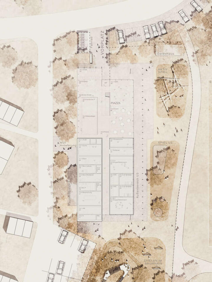
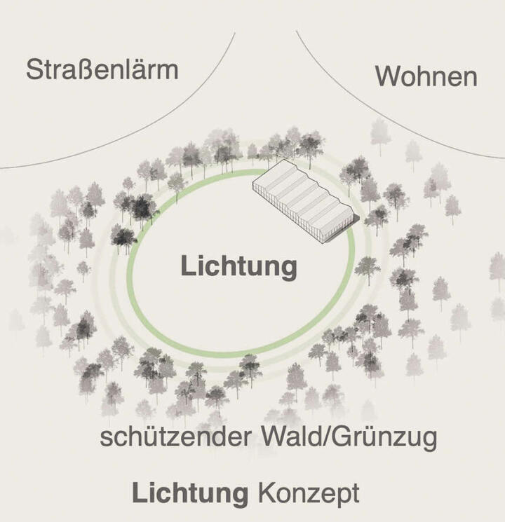
The basic concept of the open space planning revolves around a clearing motif. The adjacent forest extends into the processing area, and encloses its edge, thus forming a clearing-like situation.
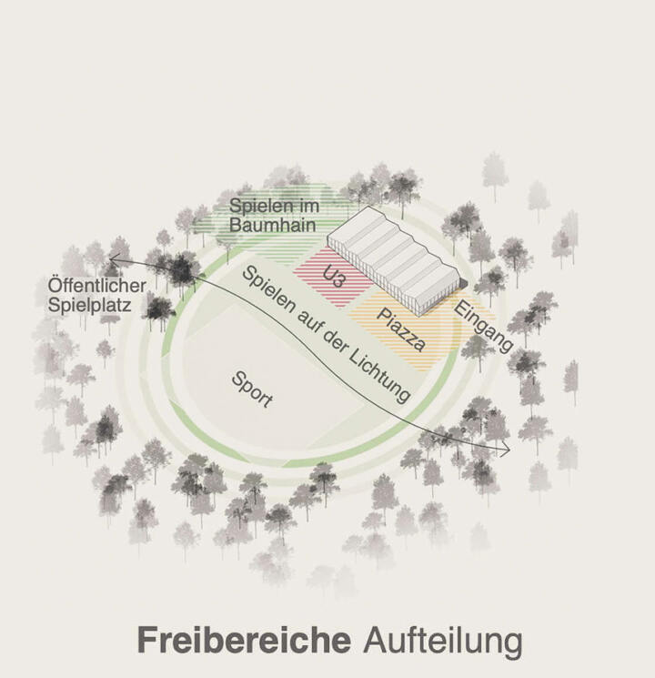
The new daycare center, with its open spaces and the existing facilities, such as the multi-generation playground and the sports field, fits naturally into the tree structure and thus syncing as part of the forest or the clearing.
The result is an atmospherically natural overall picture in which the architecture and the surrounding landscape function as a unit.
The outdoor play area is divided into three “islands” with differentiated, age-specific games. The “play islands” are implemented freely in a spacious meadow and are arranged in such a way that they are oriented towards the respective group rooms.
© mt2 Architekten I Stadtplaner BDA
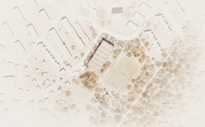
Scattered tree implementations create shaded areas and structures the overall space – in which different play areas are atmospherically created but which maintain a clearly visible and manageable system.
The aim is to create a robust, and varied range of games that stimulate the imagination and encourage the children’s urge to move.
Officebuilding GIZ Campus | Eschborn
2. Prize I Officebuilding GIZ Campus
Eschborn
In collaboration with schneider + schumacher
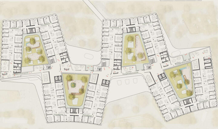
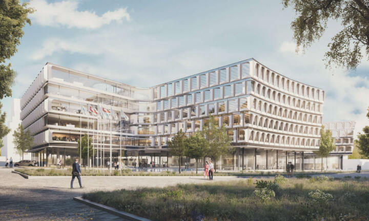
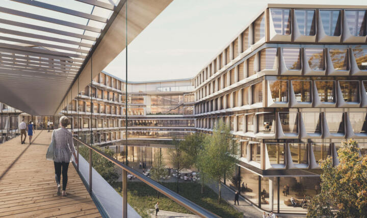
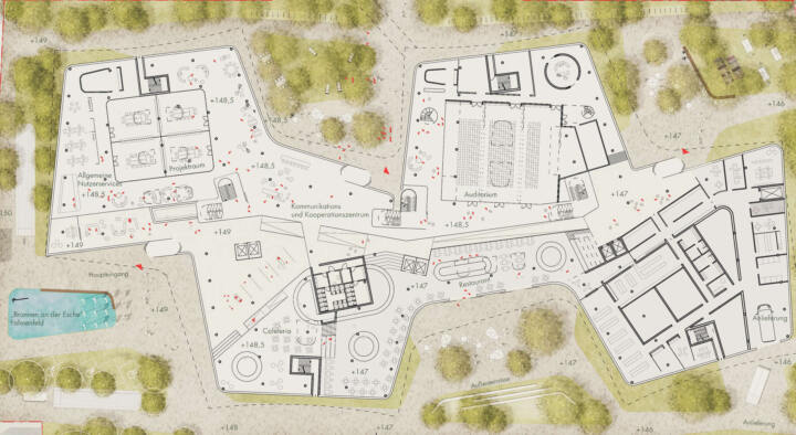
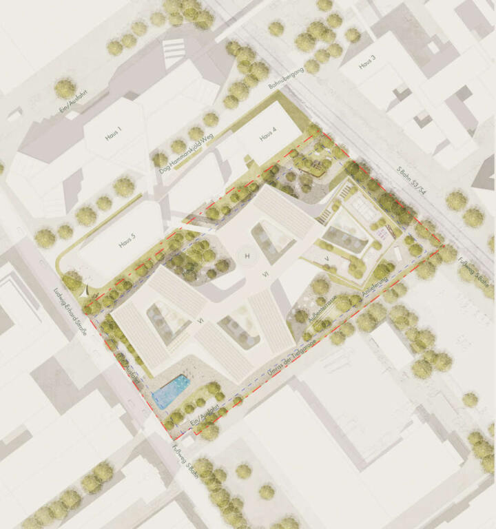
The open spaces flow around the new GIZ building in soft lines. Clinker terraces and gravelled areas interact with green spaces overgrown with trees to form a spatially attractive sequence of open spaces that can be used for a break in the open air as well as for concentrated work at individual places or a meeting in the shade of the trees.
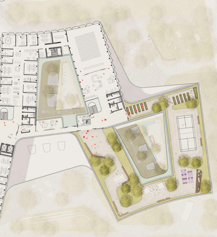
The basic shape of the building creates clearly defined outdoor areas, each of which sets different focal points for their uses:
- The forecourt as a prelude and welcoming place is paved to the necessary extent, and offers enough space for arriving groups, waiting people and cars driving up. In the center, a decorative bed with moisture-tolerant plants such as brightly flowering irises and tall sedges collects and cleans the rainwater from the adjacent areas.
- The courtyard in front of the staff restaurant is screened from the street by a gently rising embankment with seating steps and a planting at its back. The size of the courtyard is designed in such a way that individual tables can be placed slightly apart from each other so that they can also be used as desks or for meetings.
- The delivery courtyard is screened off at the south-eastern corner.
- The two northern courtyards are limited by the wooded islands and are also less sunny overall due to the building shade, which is beneficial during breaks as well as when working during the warm months.
- The courtyards are also designed to move the small informal meetings in the tea kitchen outside in a very short distance. The terraces are embedded in a shade planting at least waist-high and screened by individual large shrubs for privacy.
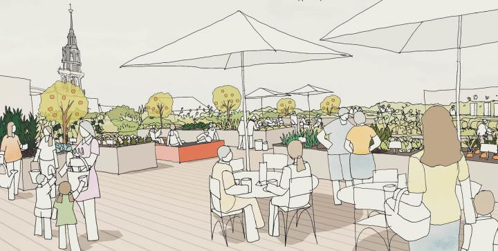
- The large roof area in direct spatial connection with the co-working and event area combines ball sports and gymnastics, breaks and urban farming as well as the possibility of working outdoors to enable informal gatherings with different groups. The individual areas are arranged in such a way that they interfere with each other as little as possible. Directly adjoining the corridor area is a large event terrace, which could also be enlarged if necessary.
The planting concept relies on a low-maintenance and robust strategy that can best be described as “controlled wilderness with increased biodiversity”. This broad ecological amplitude begins with the roofs, which develop into dry grasslands with a high diversity of species and a large number of Red List species through special substrates and hay seeds (also on the solar roofs!), and ends with the flowering wet meadow of the forecourt.
All green spaces are designed as species-rich meadows or site-appropriate woodland islands with a flowering undersow of native wild shrubs and become an important stepping stone of urban biodiversity. Where possible, surface water is channelled openly and infiltrated into hollows.
Wolffskeelhalle | Markt Reichenberg
1.Prize | Wolffskeelhalle
Markt Reichenberg
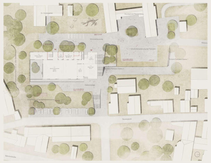
The surrounding open space of the Wolffskeelhalle is structurally divided into two levels, a “lower” level on the 2nd basement of the hall and an “upper” level on the ground floor. A spacious staircase in the context of the new building connects these levels with one another.
Lageplan © GTL
The “lower” level creates a strong connection to Bahnhofstrasse and consequently to the village center and thus brings the refurbished, converted Wolffskeelhalle more into focus, making it more present and transforming it into a clear landmark. The foyer, in front of the hall that serves as a residential stay, gives way to a public, sloping green space. A forecourt leads the visitors to the main entrance and offers space for different uses. In addition, it provides a qualitative free space for the premises of the youth center, the clubs and the foyer. A spacious wooden deck as a living element offers a view of the surrounding landscape.
Pedestrian and car access from the direction of Bahnhofstrasse and Reutergasse are clearly separated from each other. With the car you are clearly guided to the new, two-story parking deck.
The new parking deck slides into the existing embankment, creating a schoolyard extension on the “upper” level. Through this measure, the long, narrow open space of the school is selectively expanded, which creates different uses and qualities. The “upper” level is understood as an axis of open space which connects the school, kindergarten and Wolffskeelhalle to each other and serves different usage requirements. The result is a space that can be used in a variety of ways, a connection axis that also takes up the surrounding path network and joins them with one another to create different spaces that invite you to linger.
Due to the new parking deck, the existing trees on the embankment are no longer required. However, this measure is compensated by a large supply of new green spaces with numerous new plantings.
Train Station | Soest
2nd Prize | Train Station Soest
Soest
In Collaboration with Jankowski Bürgener Architekten Stadtplaner PartmbB
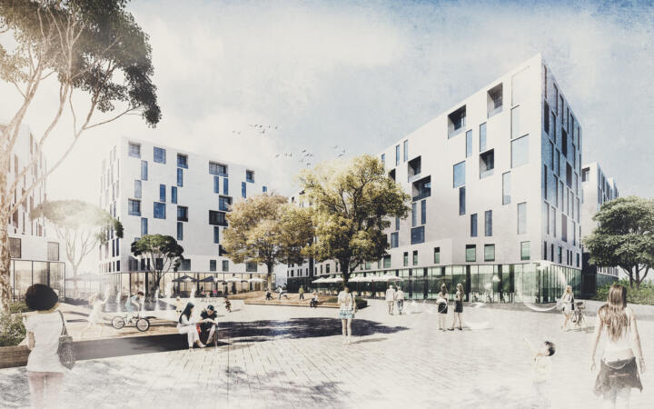
The modern urban expansion of the old city of Soest has so far been carried out by primarily building single-family houses. Consequently, no independent urban identity could develop alongside the historic city center. However, for the new station district in Soest, the design aim is to develop its own character despite a difficult location.
Lageplan © GTL
The new station district is populated by various clusters. The open block structures create diverse, varied and engaging (optical) relationships between the urban and landscape areas, which are considerably reinforced by the diverse levels and qualities of use. The clear network system creates lines of sight to the core city with the St. Patrokli Cathedral and the surrounding urban spaces. A central square forms the heart of the quarter.
The landscape concept relies on the formation of differentiated green structures corresponding to the distinct living areas, and reconnecting them to the network of open spaces. In contrast to the development, the open space is planned with an organic design language.
The quarter illustration is painted by its landscaping: an up to 8 m high plateau embankment which is structured with plant groups and playgrounds, opening up new perspectives and visual connections to the surrounding area and the cathedral in the city center. This fixed point of reference is always visible from the access road.
The heart of the quarter as a central open space acts as a bracket between the neighborhoods to the north and south. The traffic areas are planned as “shared space” for all road users.
With the communal inner courtyards and the individually designed private open spaces in the form of tenants’ gardens, terraces, loggias and roof gardens, in addition to the public green connections, the design offers various quality open spaces that caters for the different population groups in the neighborhoods and in the quarter distict.
Community School | Neunkirchen
2. Prize I Community School
Neunkirchen
In Collaboration with troi Architekten, Aachen
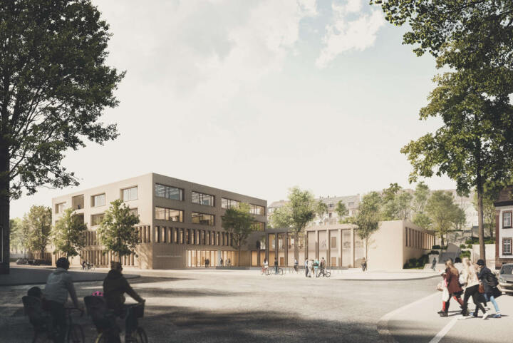
The town center community school is being redefined in terms of structure and content. The new design emphasizes this notion with an assertive, and striking architecture. Urban spatial edges are included and partially expanded. The building blends harmoniously into the intended construction window.
The forecourt created by the new school building along Lutherstrasse forms a clear landmark as public space, and functions as a meeting point and lounge for the students. A high-quality, public and urban space will also be created for the entire quarter.
Lageplan © GTL
The playground is distinctly framed by the existing terrain and is accessed from the 1st floor. A generous, topographically modeled lawn divides the playground into different areas of use (including sports, school garden, and recreation area) and additionally serves as a lounge and activity area for the students.
An important existing tree in this area is being preserved and supplemented by further tree plantings to create a loose tree grove.
Along the existing wall, tribune-like places to stay are created, from which one can oversee what is happening in the playground. A climbing wall is also added on it to encourage movement. Alternatively, this area can also be used as an outdoor classroom.
A school garden is located in front of the dining room, which teaches the pupils the subjects of nutrition, health and understanding flora through practical use.
Literaturquartier | Essen
3. Prize | Literaturquartier
Essen
The design strategy provides the open spaces created by the buildings, spatially strong and versatile atmospheres that further create diverse, and high-quality places of stay.
Surrounding, and existing connections are linked to create a strong network.
The concept enables a strengthened east-west connection, which ensures a clear and well-arranged flow of pedestrian and bicycle traffic. This connection has a strong urban and public character, which allows versatile uses and functions.
Darstellungen: GTL
The design of the central square of the quarter, which is part of this connection, divides the usage requirements into lively, open areas and quieter areas of retreat. This is achieved by means of strict space-forming elements in the form of folded, partially greened wooden decks. These are arranged in such a way that a clear axis is kept free to ensure traffic influx.
The three decks move away from the traffic axis and thus create locations that are centrally located on the square, but simultaneously have a certain distance from the heavily frequented area of the square. In addition, the open spaces assigned to the buildings are kept free for commercial and gastronomic uses. There is a clear zoning of the square!
The greening of the north-south connection flows into the more private courtyards of the development, creating a more spacious, park-like atmosphere. Diverse, and selectively set play areas are integrated into the design of the green spaces which create a varied, and creatively appealing offer. While tall trees on the urban east-west axis emphasize the generosity of the open space, in the north-south connection, smaller multi-trunk tree plantings in combination with wild perennials are implemented.
Our design language is influenced on the one hand by the urban structure and in an abstract form on the subject of literature. The folded wooden decks are derived from the image of an open book and materialized. They can be used in many ways, whether for sitting, lying or playing. You have to explore and discover it … just like a good book.
Townhall of the future mg+ | Mönchengladbach
3rd Prize | Townhall of the future mg+
Mönchengladbach
In collaboration with RKW Architektur+, Arup Deutschland GmbH, Görtzen, Stolbrink & Partner mbB
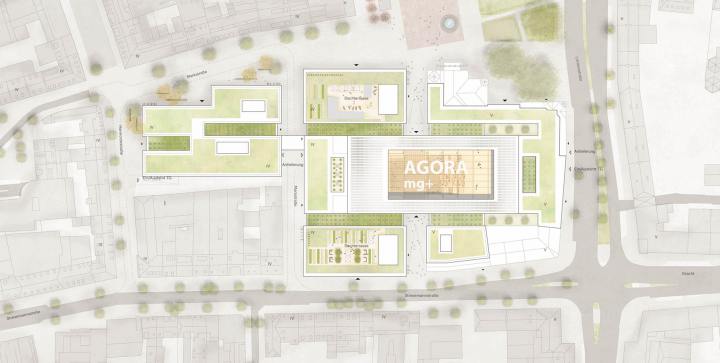
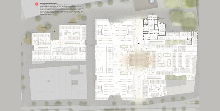
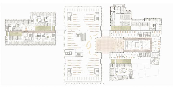
The competition entailed designing a harmonious fusion between the historic townhall and its contextual block structure, the Karstadt department store and the Sparkasse building to form a unified core ensemble.
In order for this combination to succeed, the focus of the design resided on a central square in the heart of the ensemble: an agora. Through it, the connection between the market square and Stresemannstraße widens, and the narrow north-south axis further creates a spacious room that adds to the east-west dimension. Hence, a plus arises.
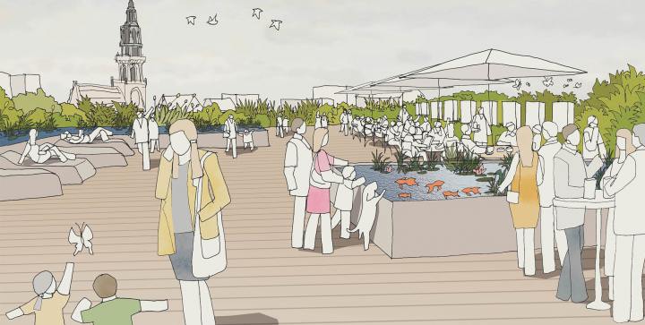
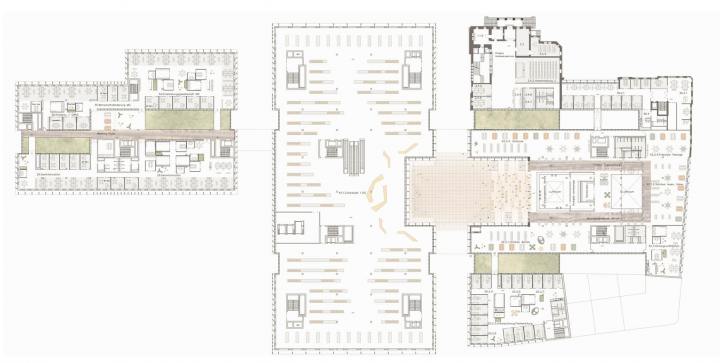
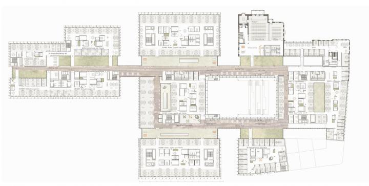
Green axes were developed to compliment the design in terms of functionality, environmentally, aesthetically and as a health factor with regard to indoor human well-being. These axes run through the building on both sides, parallel to the agora, and across all parts of the core ensemble. They are materialized as hanging gardens with an intensive planting scheme that trickle down towards a ground-level pool feature.
This combination creates its own thermal effect to ensure air renewal and filtration. In addition, the transparent ceiling structures allow daylight to filter in, which further increases the overall optical and atmospheric experience through the natural combination of light, plants and water elements. These axes are thus designed to allow for optimum meeting and relaxation spaces.
In the office spaces, natural elements are also integrated in the design strategy through green systems, living(moss) wall features and through planted conference boxes, which not only cater to private and undisturbed conference boxes, but also provide air clarity and oxygen production.
Last but not least, green roofs were also conceived as part of the design intervention through the integration of concepts such as herb gardens and beehives, which would be managed by a professional beekeeper. These measures were implemented to further impact the work-life balance of the employees.
Construction of a triple sports hall | Northeim
4th Prize | Construction of a triple sports hall with a grandstand and an outdoor area
Northeim
In collaboration with Troi Architekten
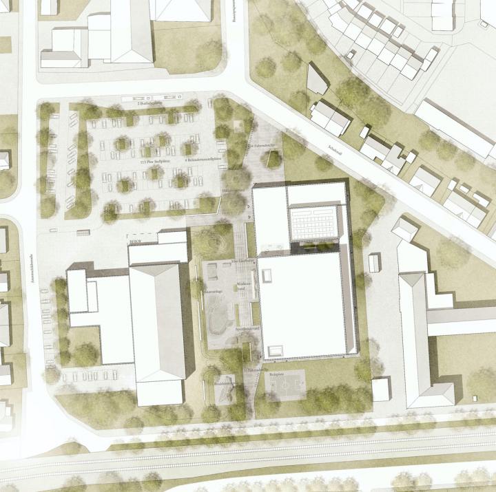
The competition requested a design strategy for the functional and high-quality embedding of the new triple sports hall, within the area’s urban and landscape context.
Along the eastern side, the ‘sports boulevard‘, a backbone access, is formed between the existing indoor pool and sports hall, and runs axially through the competition area in a north-south direction. An open space is formed towards the Schuhwall which, in conjunction with the main entrance of the hall, serves as a landmark and orientation point and provides resting spaces. Moreover, the area also mediates at the interface between the parking lot, indoor swimming pool forecourt and the adjacent district. This emphasizes it as a central node at the main entrance.
Various activity zones are located along the sports boulevard to further highlight the lively and versatile usability of the space. Activity examples include a 50m running track, skating facility, workout band, boulder sculpture, and a soccer and street ball court. Along the boulevard are selectively distributed seating to incite users and visitors to stay and linger. The design also integrates preserved and previously existing trees.
The new parking lot can be accessed from two directions via Arentsschildtstraße and Schuhwall. On the other hand, disabled parking spaces are located in the immediate vicinity of the main entrance for user comfort and safety.
The overall design of the landscape strategy compliments the triple sports hall and the immediate context as it enhances the relationship and connectivity.

