High-Rise Marienplatz| Darmstadt
1.Prize I High-Rise Marienplatz
Darmstadt
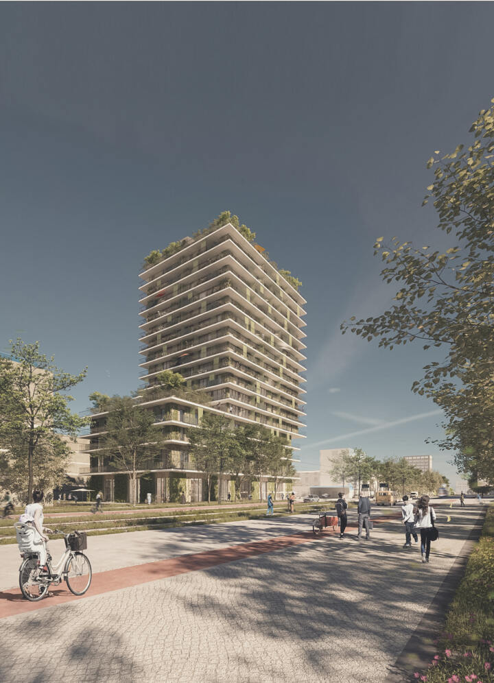
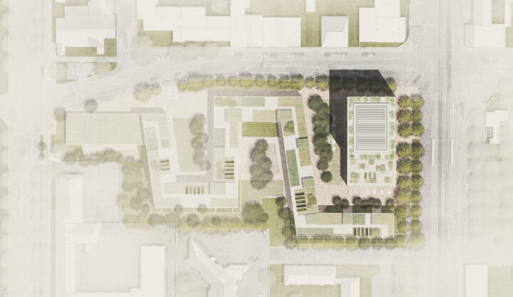
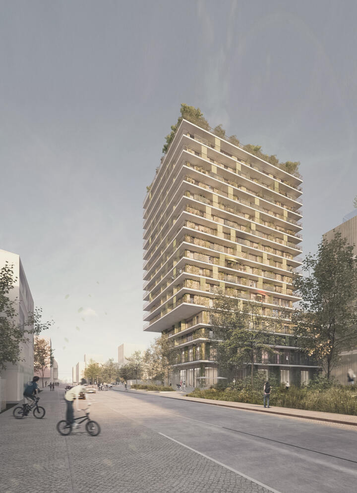
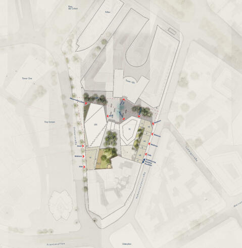
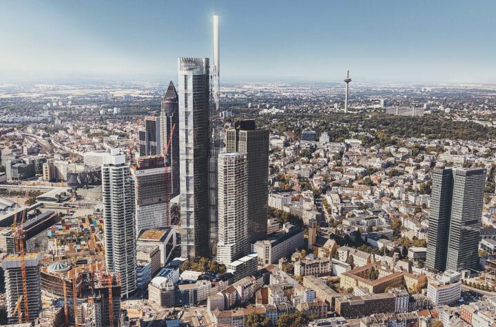
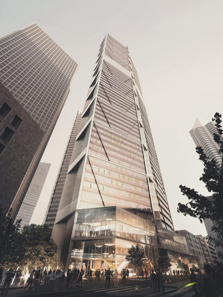
This new high-rise building creates a link between Darmstadt’s publishing district and the city centre, while anchoring the project in the existing urban context.
The characteristic profile of the high-rise, with the lower four storeys set back, will make it a prestigious address for both residences and offices. The high-rise consists of a 4-storey plinth base, plus a 12-storey block rising from it. The plinth mirrors the eaves height of the neighbouring building thus establishing a relationship with its urban context. The top of plinth is planted with a roof garden that corresponds with its neighbour too. Another feature of the high-rise block are the 1.7m deep balconies that run round the building. Permanently installed planters here are intensively planted, engendering a garden-like atmosphere, shading the façade and creating a microclimate. This greenery is further enhanced by a generous roof area, the distinctive design of the terraces, and a row of trees along the outer edge of the penthouse terrace. The aim is to use all resources judiciously in order to create a sustainable building.
The space surrounding the building is typified by a square with some areas covered in grass pavers, and informal groups of trees. Benches beneath them are designed to encourage people to linger a while. Bicycle parking is arranged along the façade and the traffic routes. The green façade at ground floor level helps to tie the external landscaping into the building.
Cuno-Raabe School | Fulda
1.Prize + Surcharge I Cuno-Raabe School
Fulda
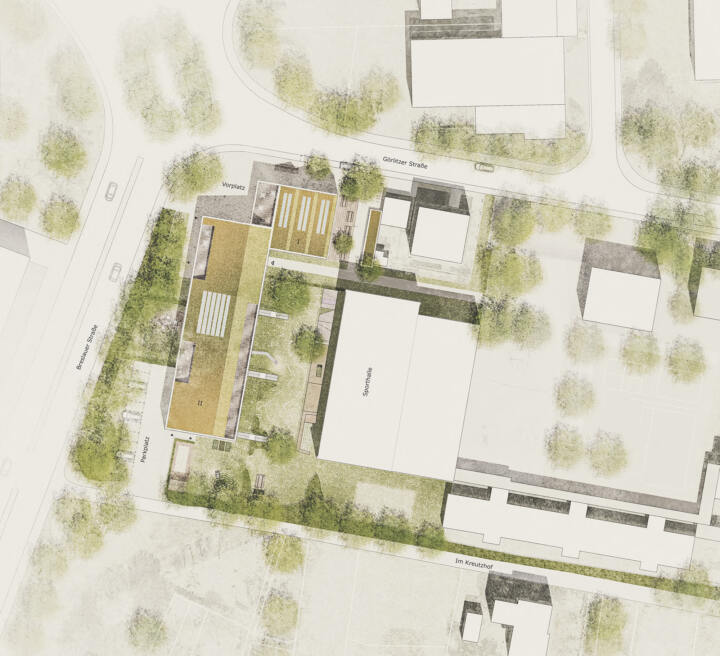
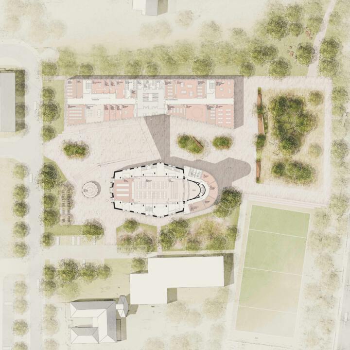
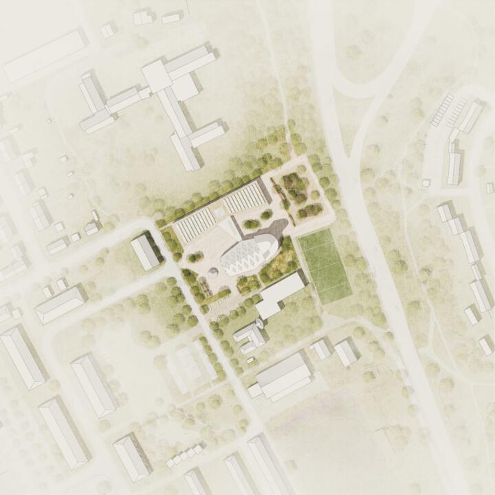
The redesign of the Cuno-Raabe School in Fulda encompasses a wide range of issues. Alongside erecting buildings, establishing fire compartments and escape routes, and generating an energy concept for the buildings, the external spaces offer high-quality, efficient and sustainable design. All this presents an opportunity to put the former church – a heritage listed building with a strong identity – to a new use.
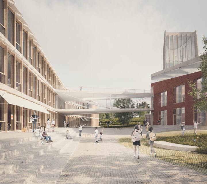
The new building, which forms the northwest extremity of the site, is being developed in conjunction with the existing church building. To bring together various internal uses – such as classrooms, admin rooms, staffrooms, a school canteen, plus a teaching kitchen and other spaces – the church’s volume is to be retained, and inside it a “house-in-house” principle will be applied. While the substance of the church will continue to provide protection from the elements, a separate building that meets the requirements for new sustainable buildings will be built inside. This will later house a school canteen, an auditorium and on the upper floor, a kitchen, areas used throughout the day, and the library. This eliminates the need for a costly energy retrofit. The bridge connecting these two buildings also creates an important external element. A fascinating interplay of façade materials and landscaping is achieved through juxtaposing the materiality of the brick church façade with that of the external areas with alternating wood, textile sunshades, and light concrete block paving.
A core element in the external landscaping concept is the playground between the former church and the new building. Bounded on both sides by stepped seating, it opens up in the centre with space-defining single trees and leads to a dense ‘play forest’ where children can romp around. Another special feature is the climbing and balancing frame that uses gravel incorporated in the subsoil to mitigate the impact of falls. Away from all the hustle and bustle is a quiet area that can also be used as a green classroom or school garden. The planting concept calls for the use of robust native shrubs in the perimeter areas that can withstand all the various demands.
Parking is being restructured in conjunction with the new building. Parking spaces will be supplemented by centrally located bicycle parking close to the entrance. The roofs of the new building, in addition to supporting a modern photovoltaic system for generating power, will be planted as extensive green roofs, plus a landscaped roof garden and a play area.
Millennium Areal | Frankfurt
Recognition I Millennium Areal
Frankfurt
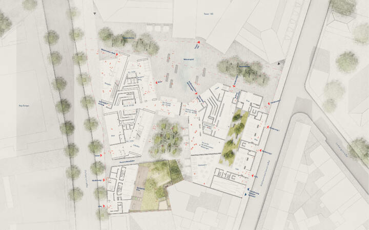
The interplay between green courtyards and stone urban space creates attractive and spatially differentiated outdoor lounges. Loosely set, the multi-stemmed field maples in the courtyard and to the left and right of the entrance plaza form a light-filled canopy that frames and sets the scene for the fountain plaza in front of the main entrance.
A cleverly controlled, flush-to-the-ground fountain and spray field, which can be turned off when needed, together with the bench elements, make the forecourt a popular gathering place. The tree canopies continue into the central courtyard, where loosely placed tree locations are generously underplanted with shade shrubs and ferns. This creates small-scale, green spaces. To make the play area in the kindergarten as contiguous as possible, a linear play and climbing element that accommodates all of the expansive play equipment uses the windowless firewall facing the courtyard.
In the courtyard, the paved amenity areas are reduced and broken up in favor of an even larger greening component.
Redesigning the Alter Markt and surroundings of Gudensberg Church | Gudensberg
3rd Prize I Redesigning the Alter Markt and surroundings of Gudensberg Church
Gudensberg
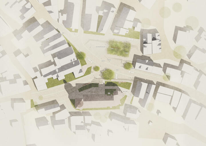
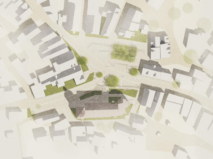
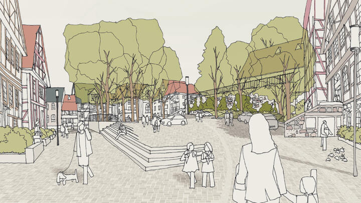
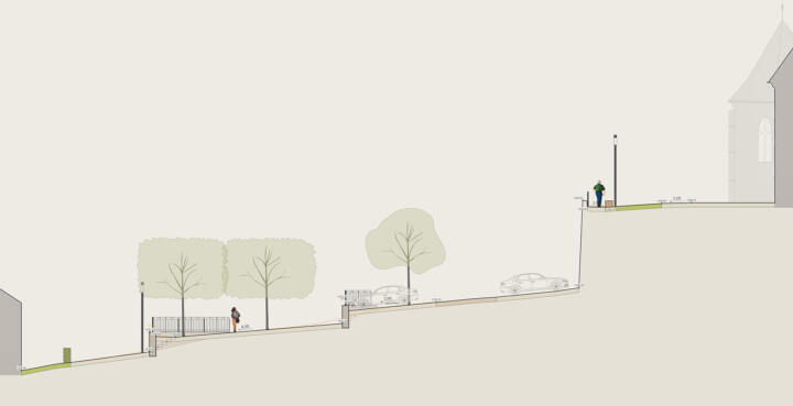
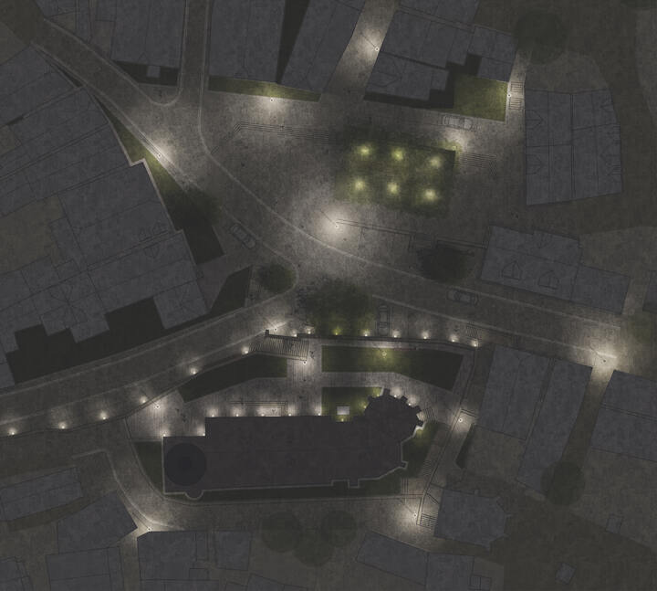
The main principle behind this concept is terracing, which is already evident in the two most prominent buildings in the town – the Stadtkirche, or town church, and the castle ruins. The terracing will be repeated on the square to highlight the historical significance of the Alter Markt, or old marketplace. The terracing is generated by walls and staircases, which help to mitigate the steeply sloping square, whereby a small and a large terrace are created, each with a different ambience and each generating their own distinctive space. These terraces fit into the intimate character of the square and take up the building lines of the old half-timbered houses. The small terrace incorporates a seating area and parking facilities. The large terrace is covered by a tree canopy and may be used for events and small festivities. In addition to helping to overcome the change of gradient, the wide staircase also serves as seating and a place where people can linger. New views and visual axes are also created. The majority of the existing trees can be retained, and these are of course integrated into the concept.
© GTL
Making use of the connecting route between Braugasse and Alter Markt, a traffic-calmed zone is created that can continue to be used by motorists. The square is no longer criss-crossed with small streets and thus creates a larger area where people can get together and pass the time. All access routes will remain freely accessible for cars. In terms of sustainability, the existing trees will not be significantly affected, as it they are evidently not suffering from disease or similar problems. These large plane trees provide a pleasant leafy canopy, so people are protected from rain showers and strong insolation.
Of the seven plane trees, only one will have to be felled and this will create a uniform group of six, which increases the intelligibility of the square. Some contouring of the plane trees and lime trees may also take place.
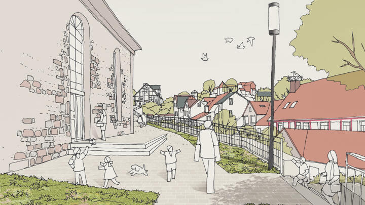
In the churchyard, the topography will be altered so that access to the church is also step-free. The entrance redesign includes various new elements and paving using natural stone slabs.
Ochsenau – Bereich Ost | Landshut
2nd Prize I Ochsenau – East area
Landshut
In collaboration with Troi Architekten
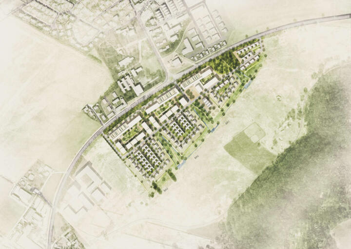
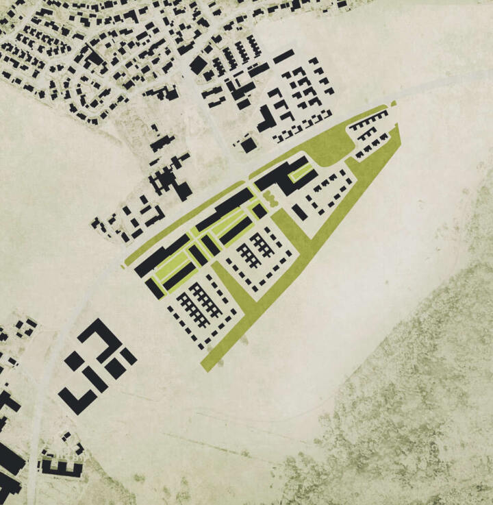
The development of the Ochsenau district is based on its surroundings and the parameters requested by the sponsor. In the northeast, the competition area borders on LAs 14 and forms a clearly visible border in this zone. The existing near-natural hedge also forms the first noise protection frontier caused by traffic on LAs 14. The development is roughly formed from north to south, starting with the district parking garages.
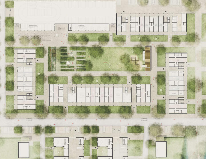
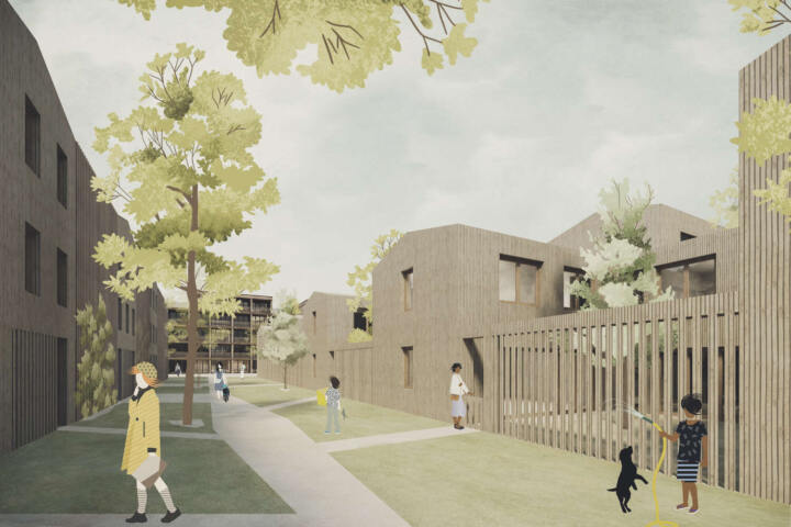
The multi-storey car parks on the northern border combine the necessary parking spaces with effective noise protection and attractive workplaces and mobility stations. A large part of the motorized vehicles are already lead into the parking garages at the entrances of the quarter. In addition to the district garages, the apartment building forms spacious courtyards with a high quality of stay. As a shared-space area, a central east-west axis forms the connecting link between all areas of the quarter. To the south of this axis are the terraced courtyard houses and the single-family houses, which, due to their lower height, also allow parts of the apartment building to have a view to the south. The single-family houses are arranged around the terraced courtyard houses. Each of which is oriented towards the green corridor, which represents the buffer zone to the nature reserve, through the formation of the green areas.
© GTL/troi
Quarter arrangement
The implementation of the structures around the central quarter axis and around the connection to the green areas, accompanied with play and leisure facilities, results in high quality open spaces. Good accessibility to all district-formations, uses and open spaces is guaranteed for all types of recidences. Neighborhood meeting point, local supply and mobility station are organized around the central square quarter.
Open spaces / local recreation
The green corridor, which extends from east to west along the nature reserve, forms a 25-meter-deep buffer zone into the reserve. In three distinct areas, the green corridor extends to the central connection axis and forms a comb-like structure of green areas. The spacious courtyards of the multi-storey apartment building serve the majority of the community and are used with a wide variety of functions.
Usage Distribution / Residential Forms
The different residential types are staggered from north to south. By dividing it into 3 building sections in the east-west direction, a meaningful organic development is guaranteed, in which an attractive mix of living space is offered in each building section. All construction phases portray the required social and structural mix and function independently. In the first construction phase, the common large-area usage can be adapted.
All other joint uses, such as workplaces close to the home, mobility stations and parking garages will be realized with their respective construction phases. Through the use of wood as a building material, the optimal arrangement of the buildings and the formation of the multi-storey apartment building on a grid, an ecological, high-quality residential area is created with an energetically well thought-out sustainable development.
Alternative Parking Concepts
The multi-storey car parks also include alternative parking concepts.
In addition to the designed parking spaces, the multi-storey car parks take on other functions such as urban gardening or sports activities on the roof. Co-working is planned on the courtyard side, which can also be accessed from the “exterior” in a short cut.
The parking spaces for the terraced houses are located on the ground floor below the eastern row and contain the parking spaces for all residents. The traffic is already intercepted at the central axis and diverted into the depths of the quarter. Only the small number of single houses is approached directly by car via the play street. Last but not least, the visitor parking spaces are located along the axis of the quarter.
Redesign of Holstenstrasse of the Old Market | Kiel
Redesign of Holstenstrasse of the Old Market
Recognition Kiel
A new city parquet for Kiel
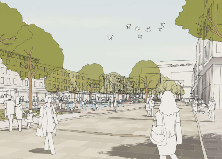
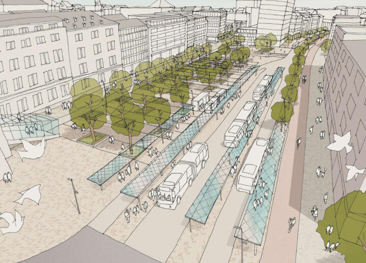
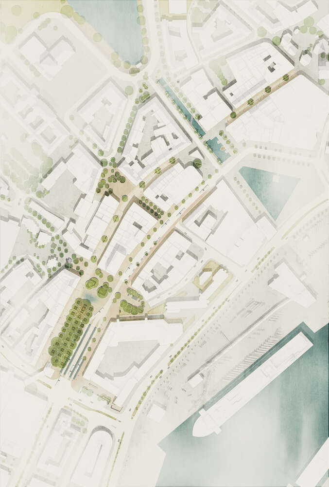
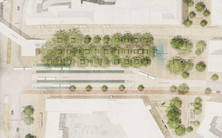
As a result of the central inner-city redesign, specifically the areas of Holstenplatz, Schevenbrücke to Heinrich-Ehmsen-Platz and Oberer Holstenstraße, a coherent urban hub has been created that does justice to Kiel’s influence as the state capital.
In order to create a timeless effect, a combination of granite flooring, uniform in terms of materials and colors, combined with new furniture, additional tree plantings and attractive water features, are chosen to function as a place to stay and stroll through.
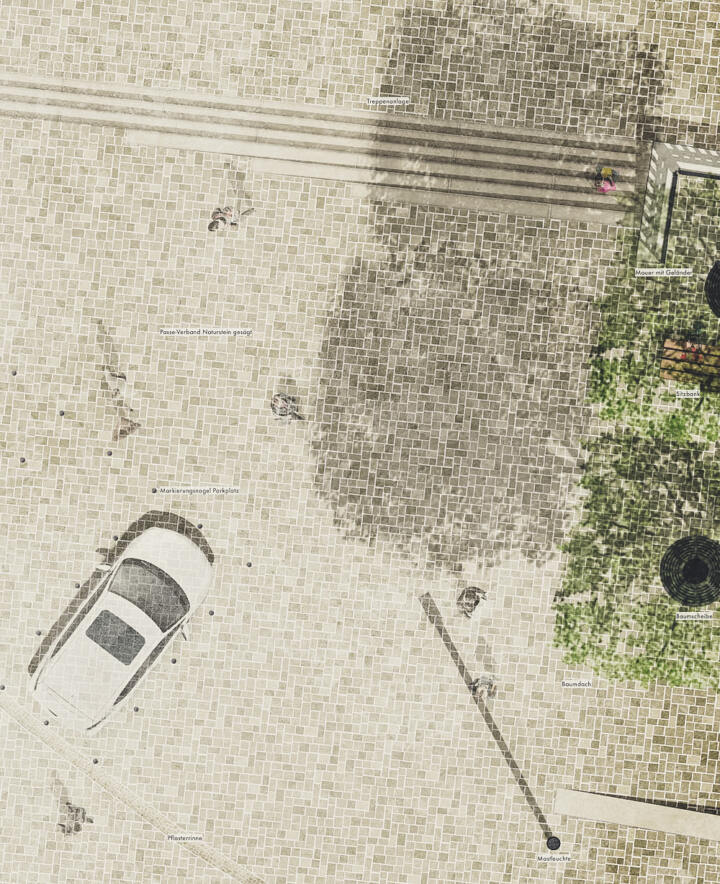
The new urban parquet, made of gray-beige granite, translates the traditional facade and slab design, into a contemporary interplay of different formats and layouts. These allow a simultaneous subtle yet clear differentiation between the central promenade and docking squares.
Perspektive © GTL
The surface color, “the flaneur’s facade”, deliberately sets it apart from the clinker brick facades, and with its warm gray-beige, creates a neutral framework for the heterogeneity of the facade materials.
Only two elongated formats are selected for the entire competition area, with the smaller format in a ratio of 1: 3 to the larger panel format in order to achieve a precise interplay of the joints.
The larger panel formats of the “carpet” connect the old town and the Holstentörn. Along the façade, the smaller city parquet is laid in rows of three, thus defining a front zone for outside catering and displays. This also applies to the seating arrangement.
As far as the surface is concerned, these are defined by the laying of the smaller hardscape in a herringbone structure, which is additionally placed on the Holstenplatz by banding in the row structure.
Complementary additional trees play a role in strengthening the spatial qualities of the inner cit, while also highlighting the different characters of the individual squares and streetscapes:
- In the southern part of Holstenplatz, the completion of the sycamore square resolves the existing diffuse spatial situation
- The loose tree position of Europaplatz and Heinrich-Ehmsen-Platz are connected by additional tree plantings in Scheuvenbrücke and western Fabrikstrasse
- A continuous row of trees along the concave side of Holstenstrasse emphasizes the slight curvature of the street
- The very unique character of Asmus-Bremer-Platz with its loosely placed sliding roof is underlined by a modification of the furnishing concept
Regarding the details of the urban spaces:
Holstenplatz
The demolition of Andreas-Gayk-Straße with the simultaneous expansion to the central public transport hub enables the opening of the square towards the bus platform.
The tree roofing, reinforced with the addition of new plantings, creates a pleasantly cool place to stay in summer, and sufficiently sunny in winter. The tree locations receive new edging, each of which accommodates benches on two sides in an alternating arrangement. By introducing an approx. 10 cm thick layer of mineral vegetation, the tree grates can be planted with robust, low grass and shade loving perennials without affecting their current stand.
In the northern area of the grove, there is a playing field made of a color-coordinated fall protection surface. Trampolines, balancing elements, climbing sticks, a sand game and course elements create an attractive play area. This attraction is further complemented by the adjacent fog and fountain field. Fountains that are controlled alternatively via time and height, and alternating with mist nozzles, are not only considered a magical place for the kids, but also a wonderful place for all visitors that come to the city to relax and linger. A subtle nocturnal lighting of the fountains that alternates with an artistic video staging of the fog clouds, makes the water feature a center of attraction even at night.
Since all installations such as fountain pots etc. are flush with the floor, the fountain system only needs to be switched off at events.
Western Fabrikstrasse – Northern edge of Holstenplatz – Schevenbrücke Connection
A supplement to the existing, loosely placed tree population with a few more trees enables a more defined connection from the urban spaces across the significantly narrowed Andreas-Gayk-Straße. To secure elevated tree locations, two raised plant beds are added in the area of the northern edge of the square in a way that ensures optimal continuity is achieved in all directions.
Holstenstrasse
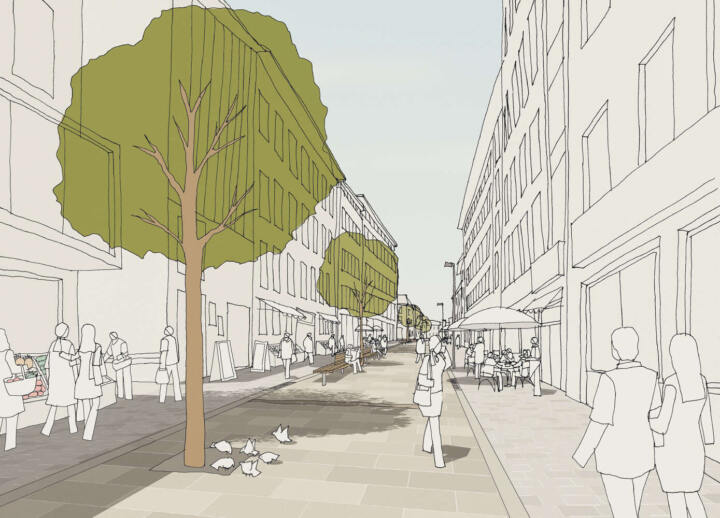
A carpet made of granite slabs of larger format connects the shopping center at Zegelteich with the old town of Kiel and leads the paving of Holstenstrasse along Holstenplatz to the Ziegelteich street.
Along the façade, the carpet is bordered on both sides by an approx. 3 m wide band made of a smaller-sized parquet in threes. This concept, is to ensure that the middle walkway is very subtly differentiated from its surrounding contexts close to the building like areas for displays and outdoor catering, simply through the size of the slabs. The drainage channel made of natural stone is – unlike in the existing structure – arranged at the interfaces between the surfaces in order to keep the main running zone free from the water flow.
Benches in the shade of the new tree locations not only invite you to linger, but are – also from the point of view of the needs of an aging society – essential for the succesful usability of a public space.
Accessibility and mobility
By completely dispensing with rough surfaces (such as natural stone paving), the entire urban space can also be utilized by individuals with reduced mobility. As for the visually impaired, there is a tactile guided tour in Holstenstraße along the two drainage channels at the edge of the walking area (implemented using stainless steel strips, obstacle-free guidance outside the outdoor catering and display area). At Heinrich-Ehmsen-Platz / west of Fabrikstrasse there is a mobility hub consisting of a taxi stand and parking spaces for car and bike sharing.
Young Lives in Coburg | Coburg
3rd Prize I Young Lives in Coburg
Coburg
In collaboration with Babbler + Lodde Architekten, NABE architecture
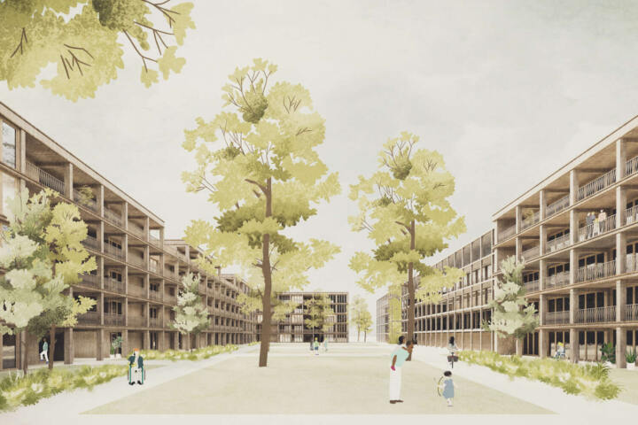
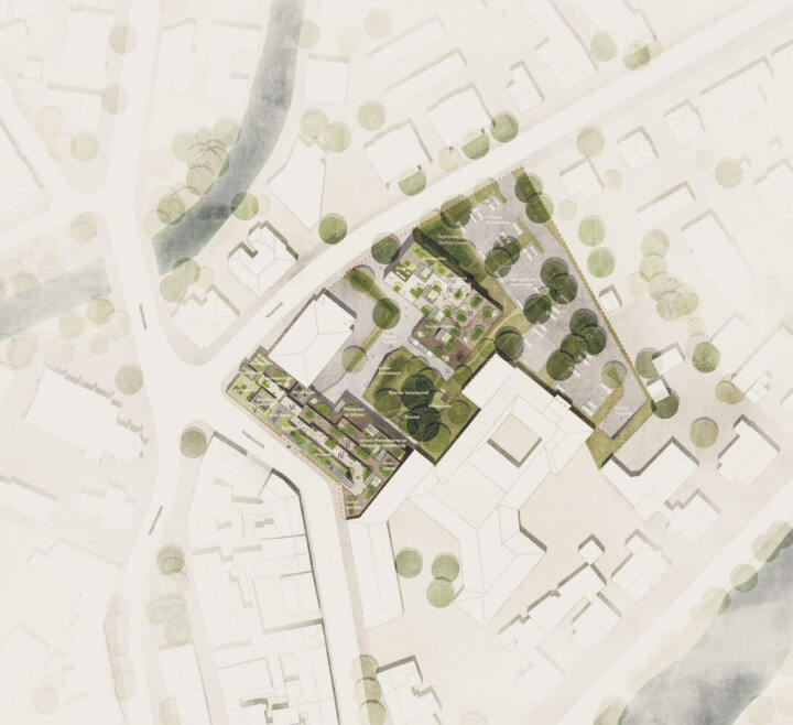
Based on our design contribution of developing Coburg into a swarm city, as an impulse project, we proposed a residential area at the interface of the inner-city urban fabric. With the new urban reorganization, open spaces and buildings shall be connected. The result is a quality urban quarter that is publicly accessible across all levels of use.
For the desired surprise-effect within the living plots of the user group of young professionals, trainees and students in the age group of 18-28, we are developing a unique landmark in a special place. The reorganization at the transition from the urban to the suburban / semi-urban structure takes place through a structural gesture with responses to the respective defining urban characteristics.
Lageplan © GTL, Babbler + Lodde, NABE
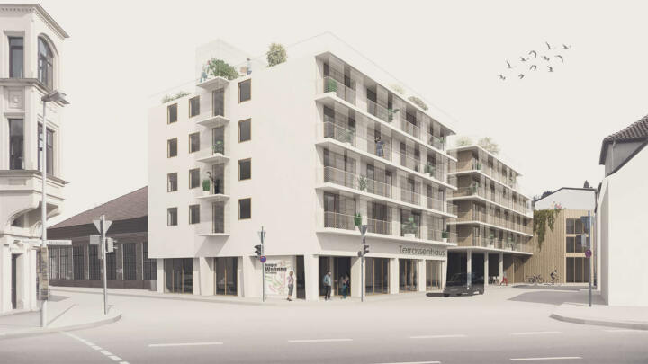
As a result of the stepped building’s inner orientation, a relaxed atmosphere portraying a more suburban building plot for private residential units with gardens and greenery is created. The common lounge area, encompassed by the building volume, is linked to the public space on its south and east sides.It is considered the heart of the quarter and can function both as a public, and as a private outdoor area. From here, clear staircases open up all the new building’s levels to the public.
In addition, and due to the proximity of the Quarter to the Itz, we encourage the development of a master plan that respects the flow of the river and the riverbank as an attraction point, and not as a forgotten backyard which brings its built-in qualities to life at least in the immediate vicinity of the competition site.
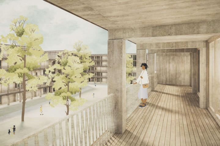
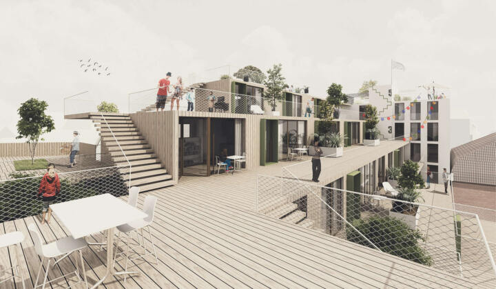
The stepped building can be accessed from the inside of the quarter via open stairs. Large terraced areas in the front allow public access to all residential units on all levels and simultaneously offer a piece of individual privacy in the form of a sun deck or roof garden.
The implementation part is also connected to the existing building, which shall be converted into “building bridges”.
The first floor of the realization section, houses the higher-level functional areas. The cafe-laundromat and common room face the inner courtyard to the south. The laundromat, multifunctional room, garbage room, workshop and bicycle storage area are oriented towards Heiligkreuzstraße.
The stairs to the standard floors begin from the passage to the inner courtyard.
The various residential units are housed on the terraced standard floors. The living modules are chosen so that each unit is always connected to the terrace on the courtyard side. All units have access to the outdoor space as a lounge and traffic zone.
State Vocational School for Product Design | Selb
1. Prize I Design Studio State Vocational School for Product Design
Selb
In collaboration with Atelier 30
Urban development context and references to open spaces
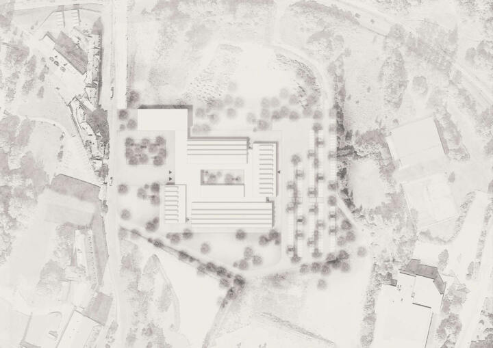
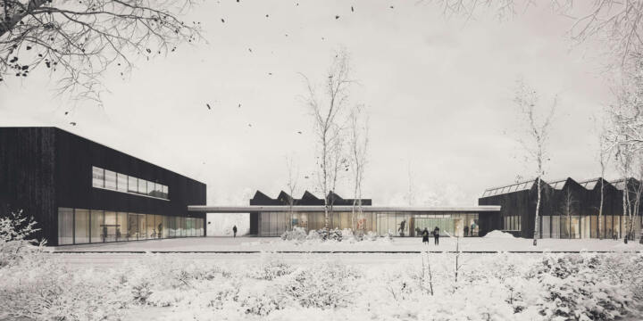
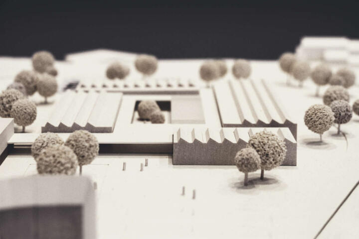
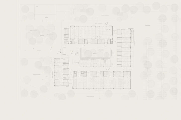
The new building is divided into four pavilions, which are arranged in a windmill-like formation around a common center with a green inner courtyard. The main building is accessed via a forecourt into a bright foyer passed Hutschenreutherplatz. A local granite paving from the Fichtelgebirge is planned for the square.
An inlaid grassy area with a birch grove and benches made of granite blocks is deliberately designed with the paving. In addition, parts of the square will also serve as an open space for the break area of the future refectory with complementary bicycle parking. The sheltered bicycle parking is located behind the passageway between the new building and the 2nd building.
Location map © GTL, Atelier 30
Due to the pavilion-like arrangement of the studios and workshops, the building communicates evenly with the surrounding open spaces on all sides. In addition, the building volume, through the presented granularity of the individual structures, leads to a subtly proportioned ensemble for the site.
In addition to the main entrance, further side entrances are created around the building at sensible locations for students. This flexible access system also allows all studio areas to be reached via an asphalt path. This is implemented via a layer of dispersed and rolled-in granite fine chippings/quartz sand mixture
A second road leads directly to the parking spaces, as well as the waste disposal area in the eastern area of the competition site. These features are proposed behind the building to give the new vis-a-vis to Hutschenreuterplatz and the Spiegelhaus-Regenbogenhaus-Pförtnerhaus ensemble an appropriate address. In addition to the proposed birch grove on the forecourt, a mixed planting of native deciduous trees is proposed on the green areas and the rest of the site.

