Construction of a triple sports hall | Northeim
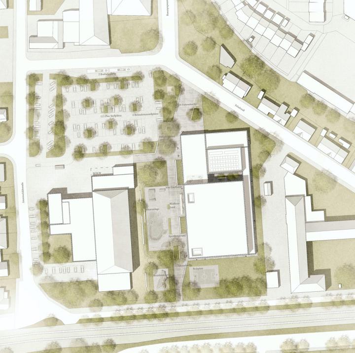
4th Prize | Construction of a triple sports hall with a grandstand and an outdoor area
Northeim
In collaboration with Troi Architekten
The competition requested a design strategy for the functional and high-quality embedding of the new triple sports hall, within the area’s urban and landscape context.
Along the eastern side, the ‘sports boulevard‘, a backbone access, is formed between the existing indoor pool and sports hall, and runs axially through the competition area in a north-south direction. An open space is formed towards the Schuhwall which, in conjunction with the main entrance of the hall, serves as a landmark and orientation point and provides resting spaces. Moreover, the area also mediates at the interface between the parking lot, indoor swimming pool forecourt and the adjacent district. This emphasizes it as a central node at the main entrance.
Various activity zones are located along the sports boulevard to further highlight the lively and versatile usability of the space. Activity examples include a 50m running track, skating facility, workout band, boulder sculpture, and a soccer and street ball court. Along the boulevard are selectively distributed seating to incite users and visitors to stay and linger. The design also integrates preserved and previously existing trees.
The new parking lot can be accessed from two directions via Arentsschildtstraße and Schuhwall. On the other hand, disabled parking spaces are located in the immediate vicinity of the main entrance for user comfort and safety.
The overall design of the landscape strategy compliments the triple sports hall and the immediate context as it enhances the relationship and connectivity.
Deutsch-Deutsches Museum | Mödlareuth
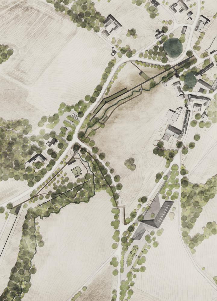
4th Prize | Deutsch-Deutsches Museum
Mödlareuth
In collaboration with Benkert Schäfer Architekten Partnerschaft mbB and Babler+Lodde architects
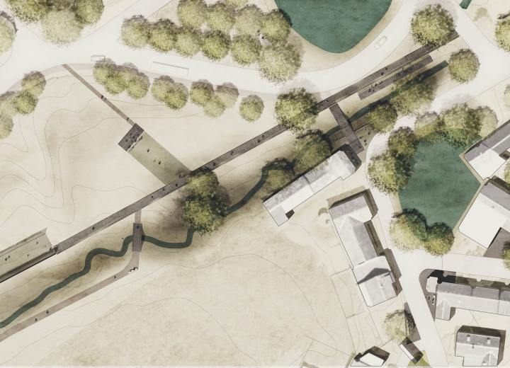
Mödlareuth is an authentic living symbol of the German division, as this partition is still present today in both appearance and structure. The wall that ensured a consistent division between east and west is still partly present and legible in the village image – They are history’s footprint. The open space concept aims to highlight this footprint, in both the village and the landscape context, to connect it with the new museum building. It shall be accessible and usable through the different levels catered for both visitors and villagers alike.
Marienplatz | Darmstadt
1st Prize | Marienplatz
Darmstadt
In collaboration with netzwerkarchitekten GmbH
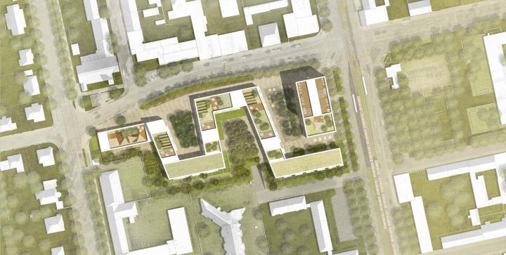
The competition included the design of a modern high-rise building with a complimentary landscape layout that would optimize usability, comfort and overall aesthetics.
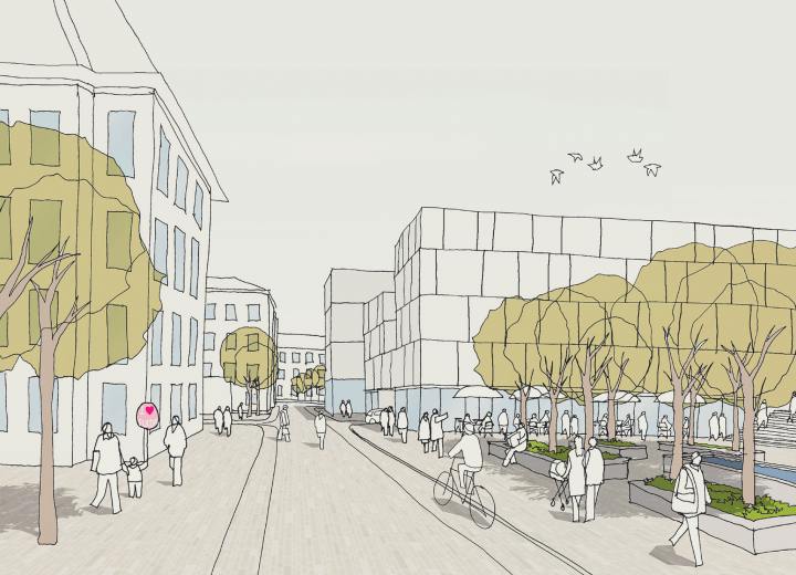
The open spaces north and south differ significantly. In the north, an urban character is portrayed along the building, supported by a uniform pavement and modern furniture. The character is specifically highlighted in the northern square. The Hügelstraße is supplemented with a pedestrian promenade that connects, on its western end, with the nursery’s forecourt via a staircase with an integrated ramp. The existing avenue, containing a row of Robinia trees, is preserved in the layout. The design strategie also opens up, in the east and west, to the city.
West of the new high-rise is a town square, which is accentuated by a contrast in the material compared to its surrounding context. The square is designed with staggered trees and seating for potential catering opportunities.
The courtyard south of the high-rise is divided by a green layout of trees, plantings and lawn. Play elements for children are also placed to encourage discovery and movement.
In the southern ground floor layouts of the building, private landscapes are incorporated with surrounding hedges to optimize privacy.
The roofs of the high-rise are designed with green terraces and urban farming elements for the residents and users.
The roof of the nursery building shall also be equipped with play elements and shade trees to compliment the outer area, where children can enjoy the largest possible movement space thanks to an installed play wall.
New Daycare Facility | Aschaffenburg
2nd Prize | New Daycare Facility
Aschaffenburg
In collaboration with Scheffler + Partner Architekten
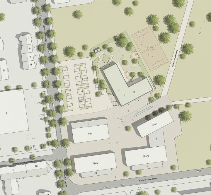
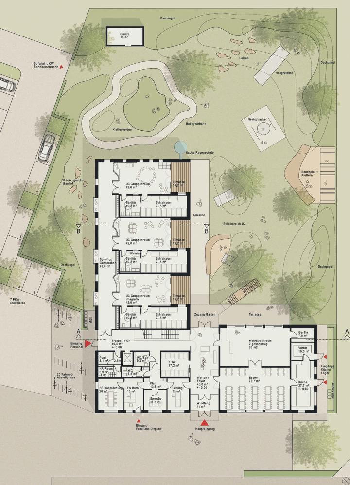
The competition entailed the design of a daycare facility with a corresponding landscape design to maximize the potential.
The playarea allows the children the freedom of space while maintaining high safety levels. The U3-groups play area is located directly adjacent to the building. This layout provides a naturally shielded space with elements such as a nest swing, small slide and sand play. The spacious terrace opposite the building gives the care staff an advantageous overview of the outside area. Older children enjoy more freedom with a space that offers the possibility to engage in Bobby Car Track, a yard and a jungle zone.
The car parking are deliberately designed without a respective driveway, and instead shall be accessed via the newly designed car park. As a result, bike racks are now placed in a traffic-calmed area and therefor safe for the children to use.
The design highlights the barrier-free concept. All rooms and outdoor facilities are accessible: the ground floor via its own access point and the upper floor via a platform lift.
Furthermore, all movement areas are designed with compliance with the legal requirements.
Extension of the new district house Nordfriesland | Husum
2nd Prize | Extension of the new district house Nordfriesland
Husum
In collaboration with Krautwald Architekten
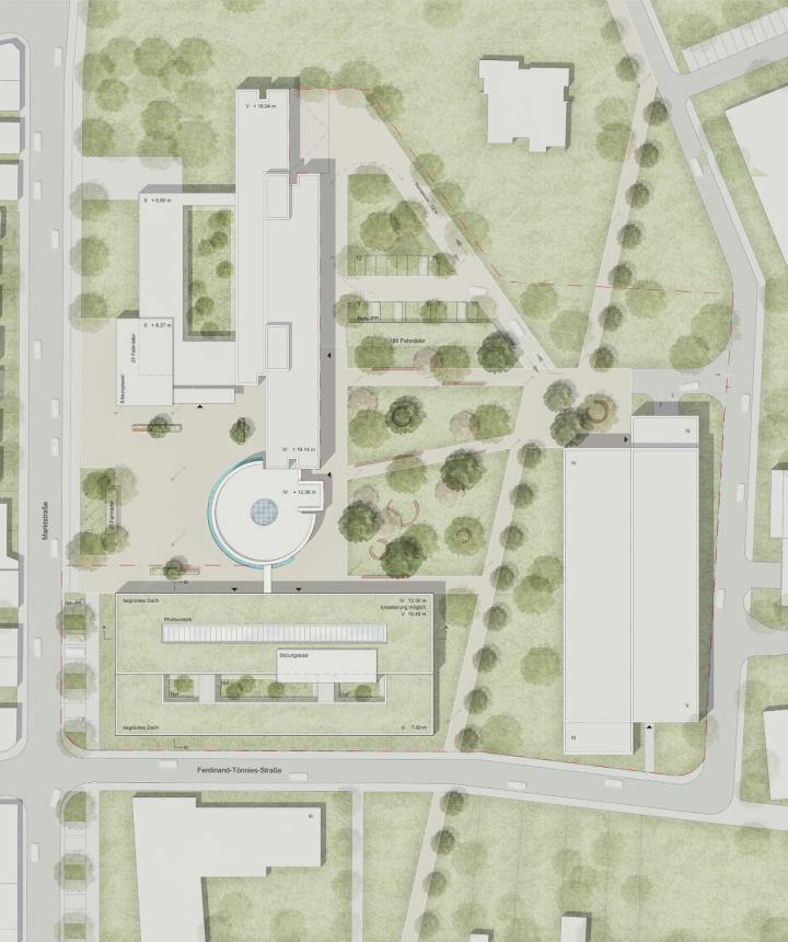
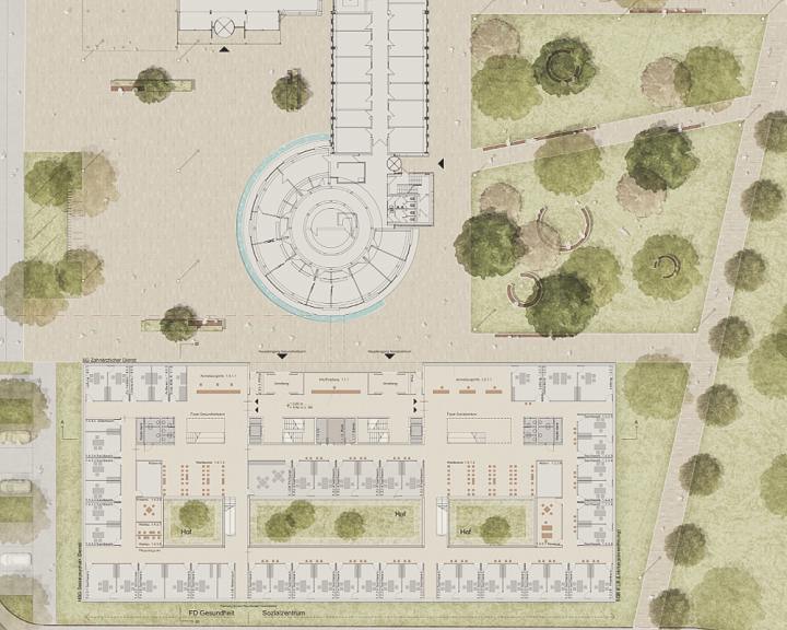
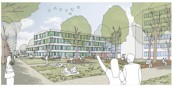
The open space concept provides a functional, structural and high quality embedding of the building ensemble (district house, new building extension, and parking garage) into the existing urban and landscape structures.
Based on the spatial footprints of the outdoor facilities, the landscape consists of a large and openly designed plaza in the area between the district house and the new extension; and of green areas, which are divided by essential path connections between the park and the district house. This area forms the ’campus‘.
The campus area spans between the multi-story parking garage, the district house and the new building extension, to create the green center, which incorporates different functions and uses. In the north, the driveway leading to the district house has been redesigned to include a cycle track, car parking, and turning options for a safer user-circulation. In the south, the design is characterized by large and easy to maintain lawn areas, and essential connections for pedestrians and cyclists.
Free and staggered-like tree placements, in combination with the diverse usability of the freely distributed seating elements, breaks the overall geometrical design and induces a sense of excitement and park-like appearance. In addition, a small square in front of the parking garage is introduced as a meeting point, entrance and distributor area for the different users. The main cycle and pedestrian connections from the north to the south are planted along with a row of long yet thin shaped trees. The new campus creates a lively hub with a high quality of stay in a higher-level city quarter.
The relationship between the hardscape and softscape creates a balanced picture of the overall open space, which interweaves and presents the historic and new architecture structures in diverse ways.
Lecture Hall and Event Center | Bremen
3rd Prize | Lecture Hall and Event Center
Bremen
In collaboration with pfp Planungs GmbH
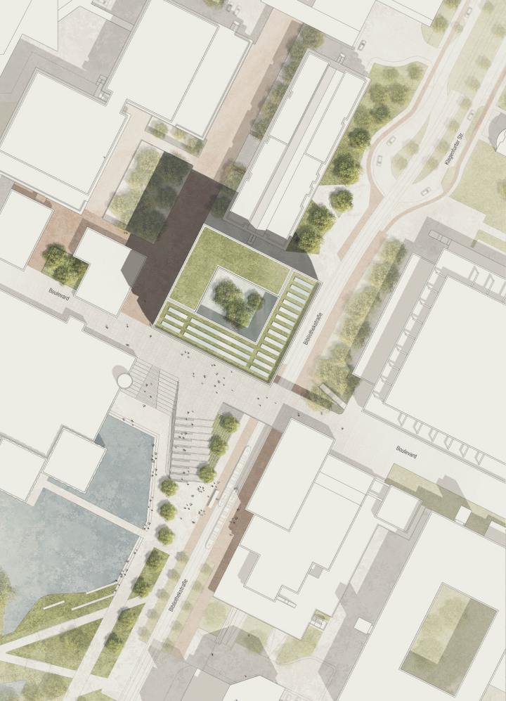
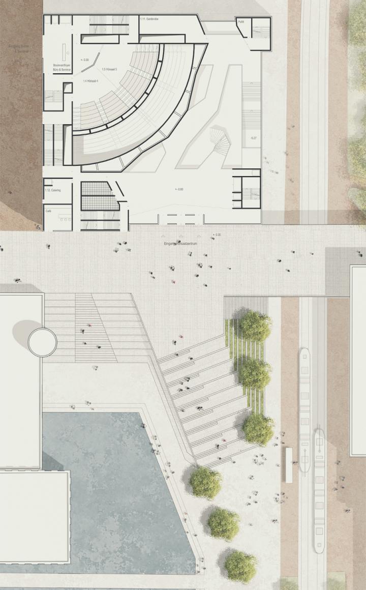
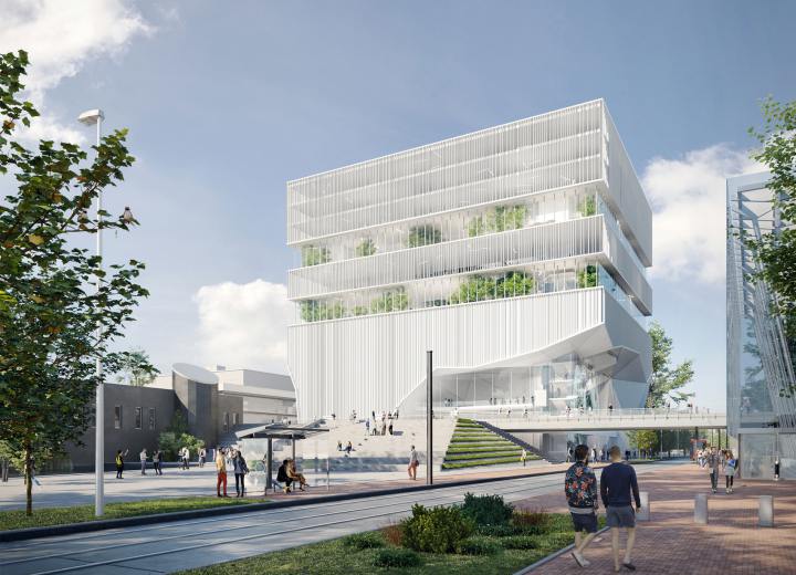
As an expression of a future-oriented University of Bremen, the competition formed the design of a new building, intended as a lecture hall and event center, to be built at the heart of the University. It is to be accessed from the boulevard and the street level via vertical foyer galleries, and via a spacious, open staircase with multiple usability functions. The open space design acts as a medium between urban boulevard and the street space and the existing campus park. Architecture and landscape interplay creates a vibrant central hub for the area with a variety of uses and amenity spaces.
In addition to fulfilling the technical requirements, the sustainability concept also targeted the users of the lecture hall center through the inclusion of psychological and physiological options. In the ‘Green Foyer‘ there will be a separate sports and gymnastics area that overlooks the city, including a running track placed in the top floor. The fitness area is incorporated between green hedges and pruned orange trees to allow some privacy from the adjacent uses (exhibitions, events, celebrations, etc.
Urban Expansion - Kronsberg Süd | Hannover
3rd Prize | Urban Expansion
Hannover
In collaboration with pape+pape architects
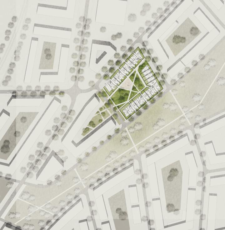
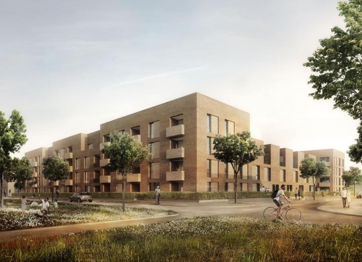
The demarcation of the outdoor areas is resulted from the private front gardens, as the apartments correlated the private gardens to the communal courtyard. The topography of this courtyard compliments the natural gradient of the site. Infiltration takes place in the central unobstructed area. The communal space is planted with large trees, whereas the private gardens are planted with flowering shrubs.
The courtyard included several amenities such as a bicycle shelter and disposal areas, as well as a playground and barbecue area located at the center. Additional bike racks are also placed at the house entrances. Each private garden is bordered by hedges to seclude them from the public and semi-public areas. All houses incorporate a barrier-free access to the gardens. Rising rainwater on the green roofs is retained and stored in the system structure. Excess rainwater is collected and used for garden irrigation.
New townhouse | Bergisch Gladbach
2nd Prize | New Townhouse
Bergisch Gladbach
In collaboration with RKW Architektur+
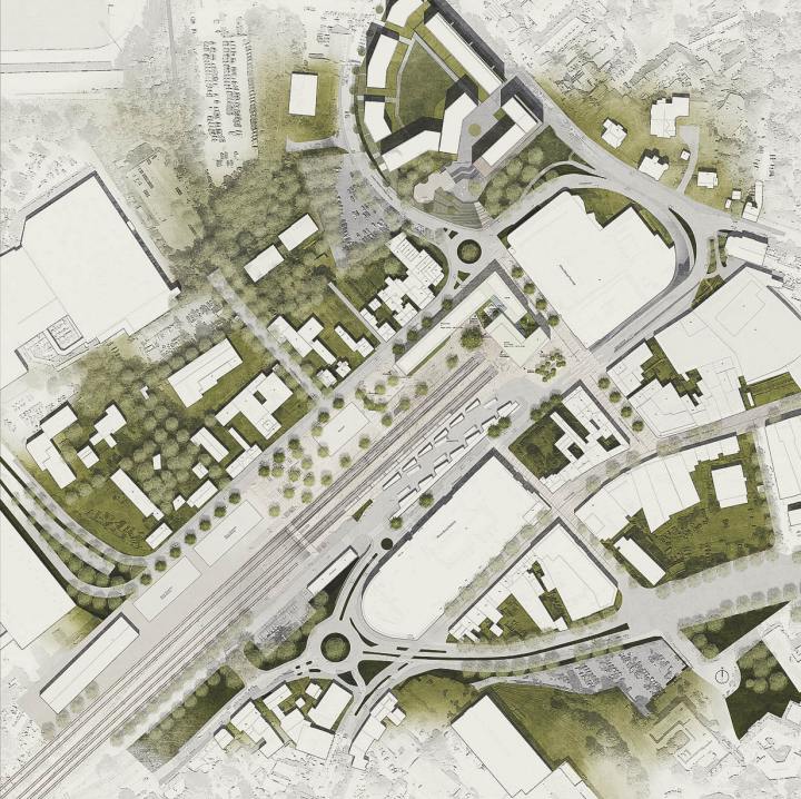
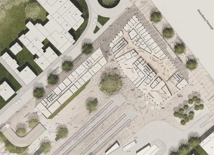
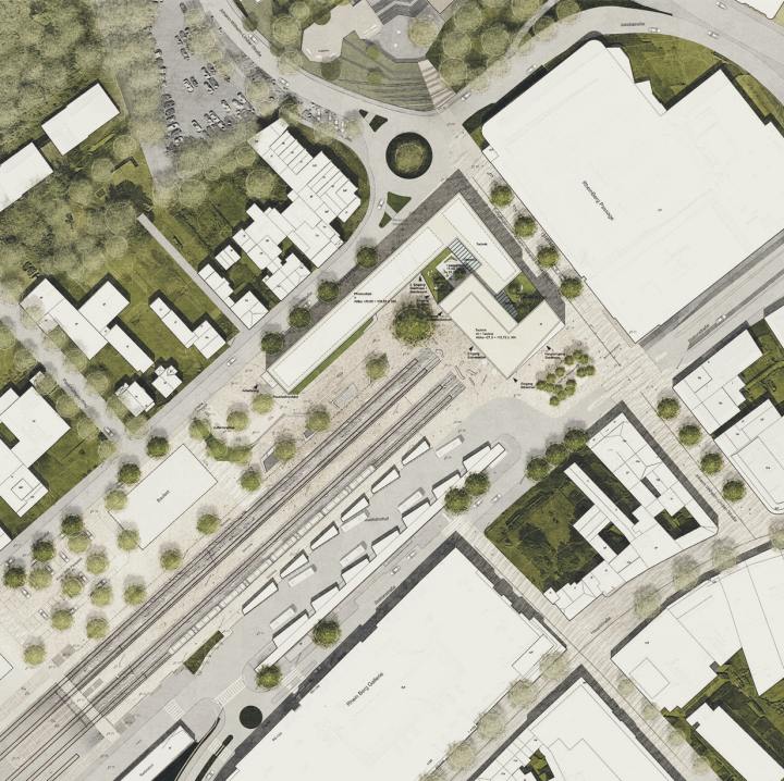
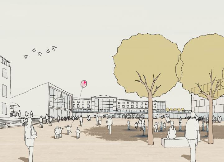
The open space concept follows the claim of optimal informal passing options of the square. The expected public flows especially at the head of the track barely disturbing influences too. Here arises a simple, paved square, the new station square, wich can be reached from all directions.
A single big tree creates the appropriate green space quality here. The roads are reshaped to avenues, the open space received around the future Kiss-and-Ride parking space a bright roof of different tree species.
Western Context of the ICE Train Station Fulda | Fulda
3rd Prize | Western Context of the ICE Train Station Fulda
Fulda
In collaboration with Schneider+Schumacher and Oppermann Ingenieure GmbH
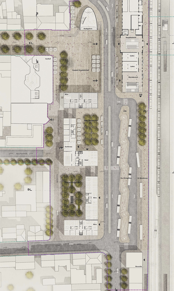
The task entailed the planning of new urban squares and green spaces, with high quality resting areas, near the train station. The developed landscape concept emphasizes the creation of open, clear, and refined spaces and pathways, which respect the demand for an optimum and functional pedestrian network through the urban space.
Dieselstraße 2c in Area Hamburg-North | Hamburg
3rd Prize | Dieselstraße
Hamburg
In collaboration with LH architects
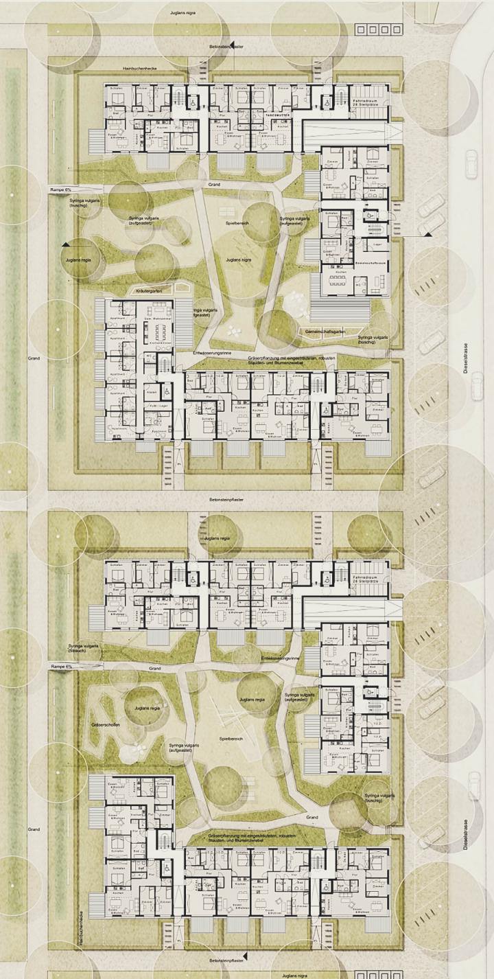
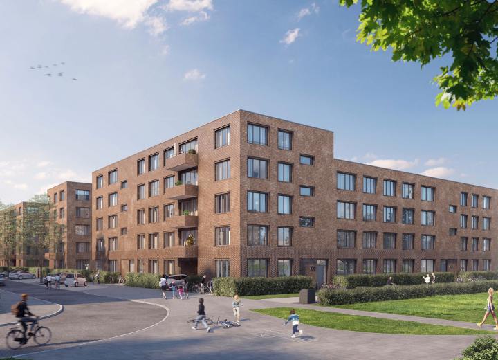
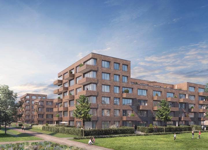
The design aims to complement the new housing development through a functional, creative, and high quality open space, which adapts with the existing urban planning and landscape structures. A new green network with essential connections has been created for the neighborhood through the linkages between the existing and newly designed open spaces.
Hornbeam hedges, a native plant which is widely adopted in designs throughout the district, is applied in the facade-side of the street and roadway as a clear distinction between public and private open spaces.
This delineation is further highlighted by rows of trees that emphasize a neat and clearly structured exterior zoning.
Contrary to the familiar and orderly layout of public spaces, the Dieselstraße design opted for a dynamic yet introverted design scheme. The composition of slab alongside polygonal grass bands, generated a semi-public and private spaces that cater to a diversity of utilization and appropriation possibilities. It allows for playful, contemplative and free spaces within the courtyards. The layout also creates a border made of grass and shrub plantations to conceal from public open space.
The result is an artistically clear differentiation between the interior and exterior.

